Creating charts
To create a chart from a data frame:
- In My projects, click the name of a project you need.
- In the project you selected, switch to the Data catalog tab.
- In the Dataframes list, click a file to select it.
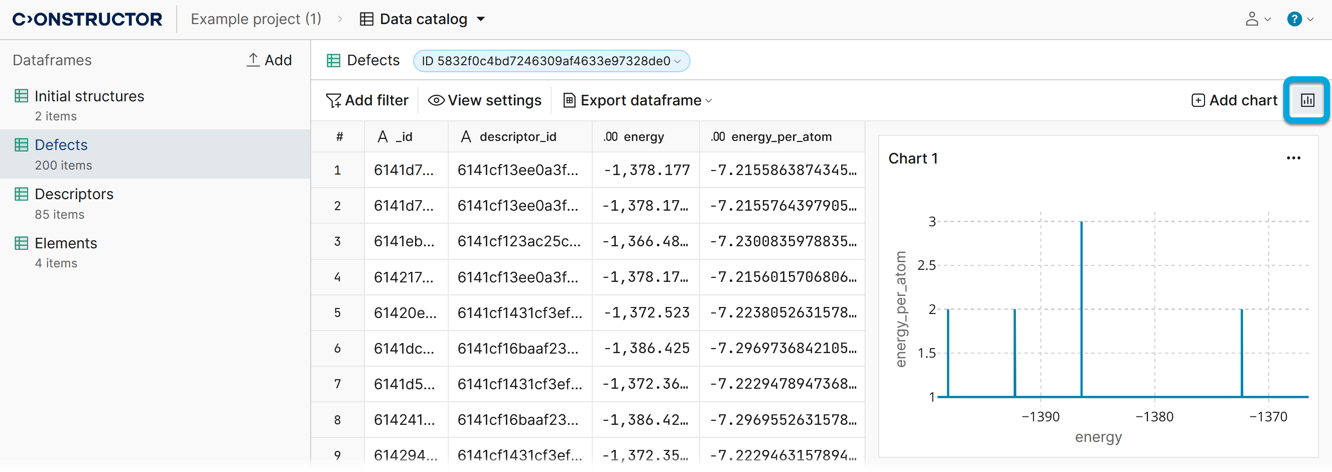
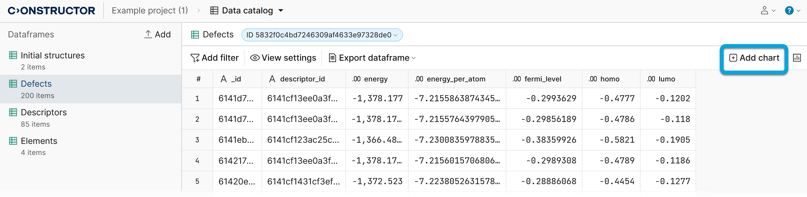
- In the upper-right corner of the screen, click Add chart.
- Configure the chart parameters:
Select the chart type:
- Scatter — a scatter chart represents values for two numeric variables on a horizontal and vertical axis. The position of each dot indicates a value for an individual data point.
Use such charts to show relationships between two continuous variables, or to identify patterns, trends or gaps in the data.
- Bar — a bar chart represents numeric values for levels of a categorical feature, with levels on one axis and corresponding values on the other. Each categorical value is represented by a bar, and the length of each bar indicates its respective value.
Use bar charts to compare values of different categories or groups, or to highlight individual values when the data points are discrete and not connected.
- Line — a line chart represents changes in value with connected points on a horizontal axis, often indicating a continuous progression like time. The vertical axis shows values for a metric of interest throughout this progression.
Use line charts to show trends or patterns over a continuous interval, such as time, or to emphasize the overall trend when the data points represent a sequence or order.
Select how metrics are distributed by the axes.
If necessary, select the aggregation type:
- Average — data is aggregated by calculating the average value. This determines a set of values' central tendency.
- Count — data is aggregated by counting the number of occurrences. This is used for categorical data or to show the frequency of certain events.
- Minimum — involves finding the smallest or minimum value within a set of data points. This is used when identifying the lowest values is significant.
- Maximum — involves finding the largest or maximum value within a set of data points. This is used when identifying the highest values is significant.
- Sum — data is aggregated by calculating adding up numerical values. This is used to show the total of a particular variable.
If necessary, select how to sort data in the chart:
- ACS — to sort data in ascending order.
- DESC — to sort data in descending order.
Apply filters to chart — keep enabled to apply the filtering.
The chart toolbar is located in the upper-right corner. Use it to select a part of the chart, zoom in, zoom out, and so on.
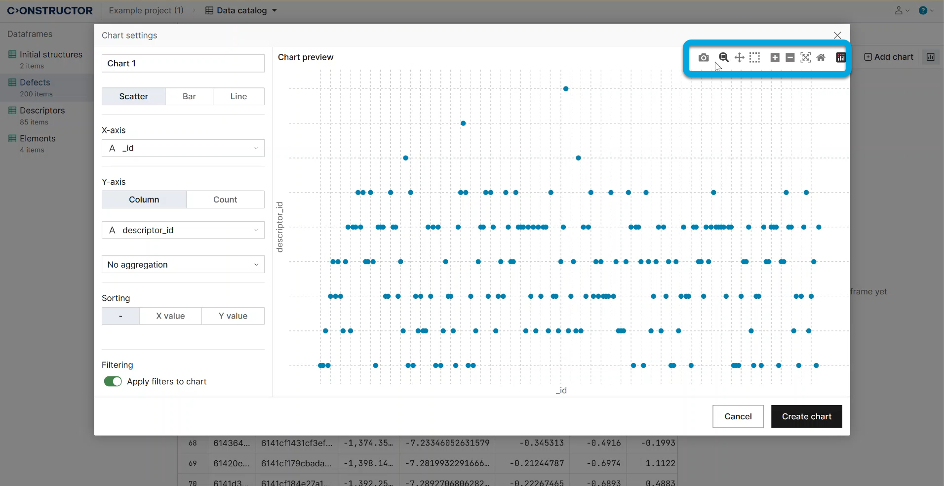
- Click Create chart. The chart will be added to the charts list available by clicking the charts button.